Responsive Website Design Services
In this digital era, mobile users have overtaken desktop users, making it essential for your website to be mobile-friendly first. A responsive website ensures that your online presence looks great and functions smoothly across smartphones, desktops, and tablets. Whether you’re targeting mobile users or aiming to improve SEO and user experience, responsive design is crucial in today’s digital landscape.
- Website Development For Construction CompanyDecember 29, 2023
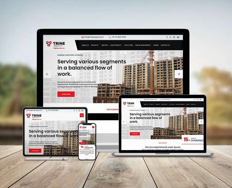 Website Development For Construction Company
 - Website Development Submersible Pump IndustryDecember 29, 2023
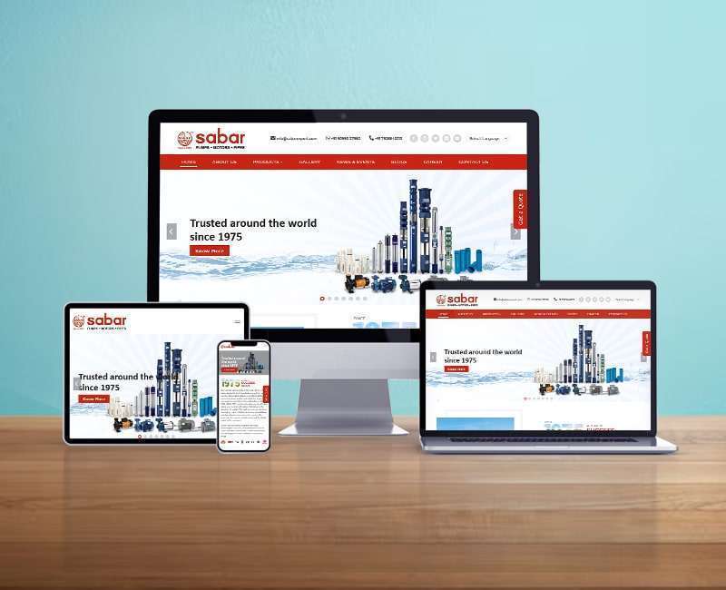 Website Development Submersible Pump Industry
 - Website Development Chemical IndustryDecember 29, 2023
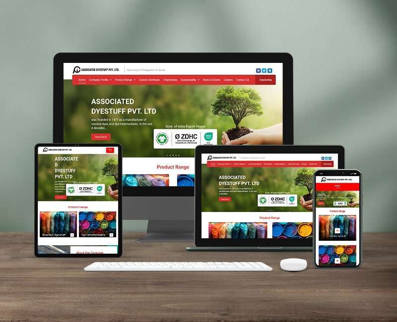 Website Development Chemical Industry
 - Website Development Industrial AutomationDecember 29, 2023
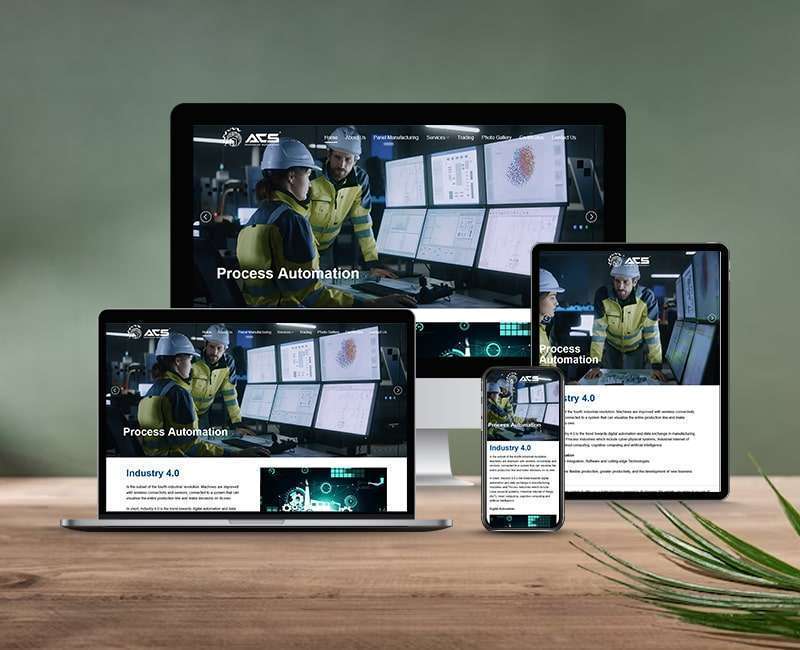 Website Development Industrial Automation
 - Saas Product Architecture Website DevelopmentDecember 29, 2023
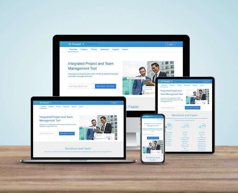 Saas Product Architecture Website Development
 - Website Development For Social OrganisationsDecember 28, 2023
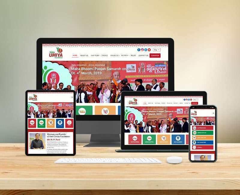 Website Development For Social Organisations
 - Job Portal DevelopmentMarch 3, 2023
 Job Portal Development
 - Web Development For ResortsDecember 13, 2022
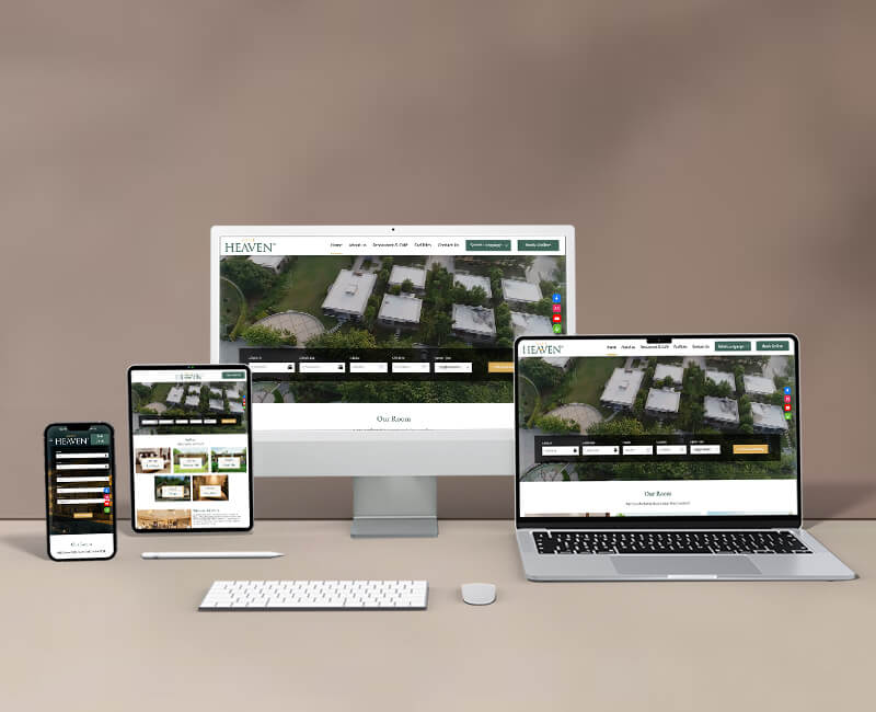 Web Development For Resorts
 - Web Development For Construction CompanyDecember 12, 2022
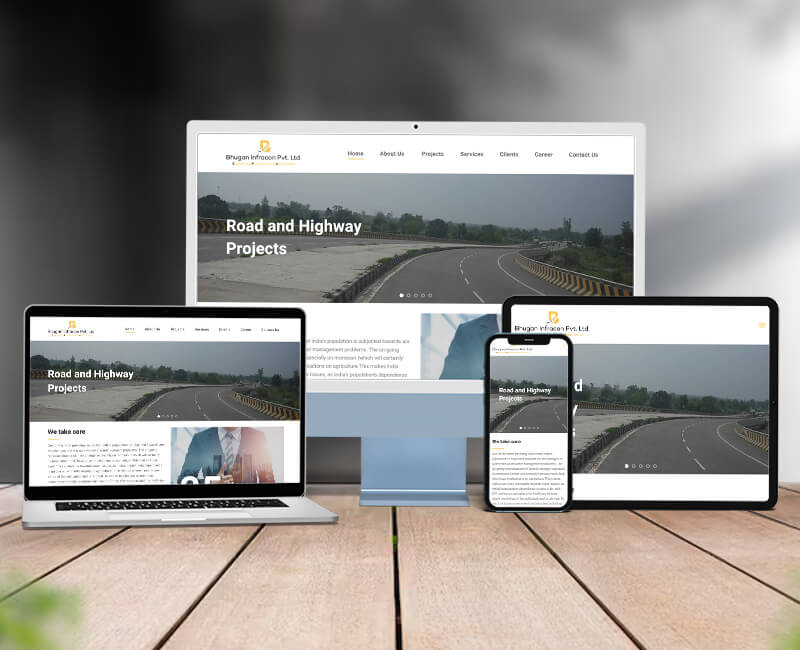 Web Development For Construction Company
 - Web Development For 2D-3D Software CompanyDecember 9, 2022
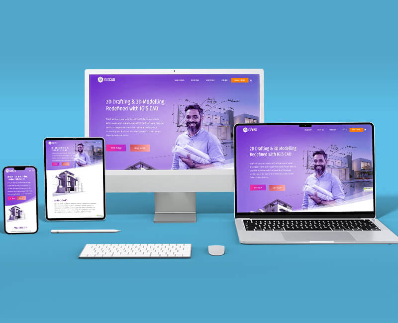 Web Development For 2D-3D Software Company
Responsive Website Design That Works on Every Screen
We creating responsive websites that automatically adapt to different screen sizes and resolutions. From intuitive layouts to touch-friendly elements, we ensure your content is always accessible, readable, and visually balanced, no matter how your users browse.
At Kumbh Design Inc., our team combines strategic UI/UX planning with clean front-end coding using modern frameworks like Bootstrap and CSS Grid. We focus on speed, mobile performance, and browser compatibility to deliver websites that not only look great but also perform exceptionally well.
Whether it’s a new website or a redesign of your existing one, our responsive design services will help improve engagement, reduce bounce rates, and increase conversions.