A growing brand usually starts considering a product packaging redesign for one of a few concrete reasons: the existing packaging no longer represents where the brand has positioned itself, the product range has expanded beyond what the original design was built to handle, SKU differentiation has become difficult to manage, or the packaging isn’t working consistently across retail and eCommerce. Each of these is a genuinely different problem, and each calls for a different amount of change. Before any artwork begins, it helps to be clear on which one is actually driving the decision — because that answer shapes layout, typography, format and how the redesign gets judged once it’s finished.
Start With Why the Redesign Is Actually Needed
Before any artwork changes, it’s worth writing down the actual problem in plain language. Is the pack failing to communicate the product clearly? Is it hard to tell variants apart at a glance? Has the brand’s positioning moved upmarket while the packaging still looks entry-level? Or is this simply a case of the design team being bored with a pack that customers still recognise and trust perfectly well?
That scenario is worth considering carefully: a redesign driven mainly by a competitor’s recent rebrand, or a general sense that the category has moved on stylistically, is a weaker reason to change packaging than a functional problem the current pack is actually creating. A trend-following redesign tends to address an internal discomfort rather than a genuine packaging problem, while still carrying the full cost and risk of a redesign.
How Much Can Change Without Losing the Customer Who Already Knows You
On a crowded retail shelf or product listing, familiar colours, pack shape, typography and other visual cues can all contribute to recognition. A packaging redesign that looks like a clear improvement in a design review can still feel unfamiliar to existing customers once it’s live, if those cues all change at once — the pack may be stronger on its own terms, but it no longer matches the pattern the brand had built up.
The practical approach is to separate what needs to evolve from what needs to be protected. Typography, layout density, finish and secondary graphic elements usually have more room to change than the brand’s dominant colour, its mark, or its silhouette. Consider a hypothetical example: a skincare brand whose amber glass bottle and sans-serif wordmark have built a few years of consistent shelf presence. A full identity overhaul here risks discarding recognition that took time to build, while a more targeted update to typography, hierarchy and finish can modernise the pack without customers needing to relearn what to look for. This is the trade-off at the centre of most packaging redesign work: newer is not automatically better if it costs the brand its recognisability.
Designing a System, Not a Single Pack
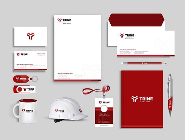
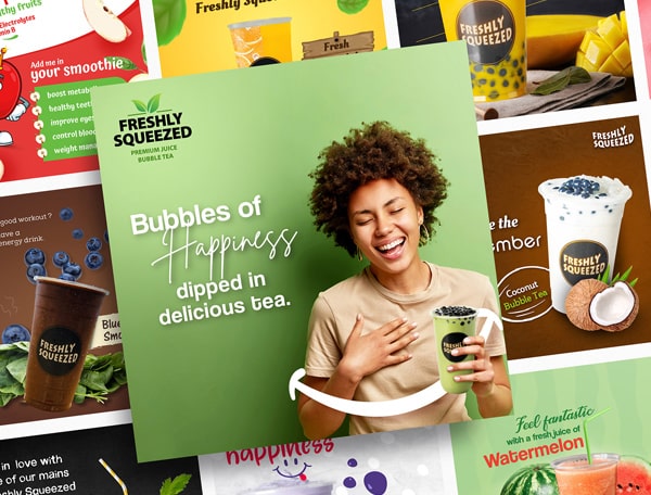
A packaging concept can look strong as a single hero shot and still fall apart once a brand carries it across ten or twenty SKUs. This is an important gap to check for in an early-stage packaging design brief — the design gets approved for one flagship product before anyone tests how it behaves across a full range. A few examples of how that plays out across FMCG and skincare ranges are in our packaging design portfolio.
A few things are worth deciding early, before final artwork begins:
- Information hierarchy — what needs to be read first (brand, then variant, then claim, then net content), and whether that order stays consistent across every SKU and format.
- Variant differentiation — a colour-coding or iconography system that lets customers tell a lavender variant from a citrus one without reading the full label, particularly important for FMCG packaging design and skincare packaging design where ranges expand quickly.
- Typography at small sizes — a typeface that looks confident on a large carton mock-up can lose legibility on a 30ml tube or a pouch label, so type choices need testing at the smallest format the range will actually use.
- Room for future range expansion — if the current range has four SKUs but the brand is realistically planning ten within two years, the system should have unused colour or layout slots built in now, rather than being redesigned again the moment a fifth product launches.
Consistency across a growing product line is harder to maintain after launch than to plan before it. Small inconsistencies — a slightly different logo placement here, a different secondary colour there — tend to creep in one SKU at a time until the range no longer reads as one brand.
Format, Materials and Production Realities
A redesign brief that only discusses artwork is incomplete. Packaging size and format — whether the product stays in the same box, tube, pouch or bottle, or moves to a new one — directly affects dielines, existing supplier tooling, minimum order quantities and lead times. Switching a format as part of a “redesign” is really a packaging engineering decision with a design layer on top, and it’s worth treating it as such from the start rather than discovering the cost implications midway through artwork approval.
Production also has a way of humbling a strong concept. A layout that looks striking as a mock-up can behave differently once printed at scale — colour consistency across runs, how foiling or spot varnish holds up on a substrate, and how forgiving a finish is to print variance. None of this should discourage ambition in the design, but a redesign that hasn’t been checked against the realities of the intended print process is still a concept, not a finished packaging system.
Packaging Now Has to Work on Two Different Shelves
For many growing brands, packaging now needs to work across more than one environment. A retail shelf depends heavily on physical stand-out — material, finish, shape, how the pack sits among competitors at eye level. An eCommerce listing depends more on legibility at a small size: how the pack reads as a thumbnail image, and how clearly the brand and variant come through in a product photograph taken against a plain background.
This has a direct effect on how the pack should be designed and photographed. A finish or colour treatment that looks premium in person can behave unpredictably under studio lighting, and packaging that photographs inconsistently can create extra friction across eCommerce and marketplace listings. For brands planning a packaging redesign alongside a growing online sales channel, considering product photography at the design stage can prevent avoidable issues later, rather than treating it as a separate task once the packaging is finalised.
Packaging Doesn’t Get Redesigned in Isolation
A packaging system sits inside a wider brand identity — the same colour logic, typography and tone that show up on the website, on marketing collateral, and in how the product is photographed for a catalogue or listing. Redesigning packaging without reference to that broader identity often produces a pack that looks good on its own but sits oddly next to everything else the brand puts out.
None of this means a packaging redesign will automatically move sales numbers — no agency can honestly promise that from a redesign alone. What a well-planned redesign can do is remove the friction the current packaging is genuinely creating, whether that’s confused SKUs, a pack that no longer matches how the brand positions itself, or artwork that isn’t holding up across a growing range.
Kumbh Design Inc. works on packaging design projects across FMCG, skincare, cosmetics and other product categories, where considerations such as hierarchy, SKU differentiation and consistency across a product range are an important part of the design process.
If you’re considering a packaging redesign for a growing product range, get in touch to discuss what the new packaging system needs to solve.
If customers can still recognise and use the pack correctly, the hierarchy is clear, and SKUs are easy to tell apart, a focused refresh — updated typography, finish or subtle layout changes — may be enough. A full redesign tends to be needed when the pack can't communicate the brand's current positioning, can't scale across a growing SKU range, or is creating real confusion at the point of purchase.
There's no fixed order, but the two work best when planned together. Packaging usually inherits colour, typography and tone from the brand identity, so redesigning packaging first without knowing where the identity is heading can mean redoing the packaging work again once the identity is finalised.
No. Many redesigns keep the existing format and dieline and focus on the artwork — hierarchy, typography, colour and finish. Changing the format is usually a separate decision, driven by a functional need such as a new product size, stronger retail shelf presence, or production efficiency, rather than by the redesign itself.
A clear reason for the redesign, a list of current and planned SKUs and variants, any existing dieline or production files, brand guidelines if they exist, and clarity on where the packaging needs to perform — retail shelf, eCommerce, or both. Having this ready shortens the early scoping stage considerably.