We feel the beauty of the world because it is colourful. The human eye loves to see colors, and the same thought applies to the design of any website, brochure, or application that we use every day.
Choosing the right website color scheme is far more than a decorative choice, it is a branding decision. Yes, in a world obsessed with makeovers, even your website needs to follow specific color guidelines when picking out “what it will wear.” The colors you use when designing your website tell an awful lot about your business, though you may not always realise it. This is where color psychology comes in: blue often signals trust and professionalism, green suggests growth and calm, while red creates urgency and energy. Understanding these associations helps you pick a palette that says the right thing about your brand before a visitor reads a single word.
Why Your Website Color Scheme Matters
Choosing a nice color scheme for your website will definitely help a user or consumer stay longer on your website page. A well-planned color scheme for website design guides the eye toward what matters most, your headlines, your calls to action, and your key messages, instead of letting too many competing colors pull attention in every direction. In fact, one of the most common mistakes businesses make is forcing too many colors onto a single page. When there are too many hues competing for attention, visitors do not know where to look first, and the page starts to feel cluttered rather than confident.
A Simple Framework for Choosing Your Palette
There is a simple framework behind most effective website color schemes. Most professional websites lean on a primary color, a secondary color, and one accent color used sparingly, often for buttons and calls to action. You can build this palette using established color theory approaches: a monochromatic scheme (shades of a single hue) for a clean, elegant look, an analogous scheme (colors sitting next to each other on the color wheel) for a natural, harmonious feel, or a complementary scheme (colors opposite each other on the wheel) when you want bold, high-contrast visual impact. None of these approaches is inherently “better,” the right choice depends entirely on the mood you want your brand to convey.

5 Modern Pastel Color Palettes for Website
Accessibility deserves equal attention alongside aesthetics. Text that lacks enough contrast against its background is difficult, and sometimes impossible, for visitors to read comfortably, so always check that your chosen colors meet basic contrast standards before finalising a design. A color scheme that looks striking but leaves visitors squinting will hurt engagement no matter how attractive it seems in isolation.
Match Your Website to Your Brand Guidelines
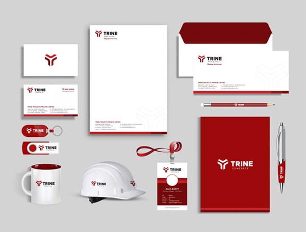
Make sure that your color scheme matches your brand guidelines. If your logo and identity are in shades of blue, then your website should generally follow the same color family, this consistency strengthens your branding and makes your business instantly recognisable across every touchpoint, from your brochure to your mobile UI design. A good designer knows that the colors which make people feel comfortable are the ones they are already used to seeing associated with your brand.
Choosing the right color scheme is one of the most important early decisions in any website design project, and it deserves the same care you would give to your logo or your brochure design. So give your website design project to an expert designer team that understands your branding and knows how to apply the right colors to your website design consistently across every page and every device.
Test Before You Commit
If you are planning a new site or refreshing an old one, working with a team that already understands color theory, brand identity design, and modern UI design principles can save you from costly redesigns later. Getting the color scheme for your website right the first time means a more cohesive brand, a better user experience, and a website that visitors remember for the right reasons.
It also helps to test your palette before committing to it fully. Colors can render differently across screens and devices, so what looks perfect on one monitor may appear slightly off on another. Viewing your design on a few different devices, and asking people outside your team for honest feedback, is a simple way to catch problems early. Keep your palette to a manageable number of colors, generally no more than three to four core shades plus their tints, so your site stays easy to navigate rather than overwhelming. When color, contrast, and brand consistency work together, your website stops being just a collection of pages and starts feeling like a true extension of your brand.
Start with your brand guidelines, if your logo already uses a specific color, build your website palette around it. Pick one primary color, one secondary color, and a single accent color for buttons and calls to action, and use color theory (monochromatic, analogous, or complementary) to keep the combination harmonious.
Color psychology explains how different hues affect the way visitors feel about your brand before they read any content, blue tends to convey trust, green suggests calm and growth, and red creates urgency. Choosing colors that align with the emotion you want your brand to evoke makes your website design more effective.
Most well-designed websites use no more than three to four core colors, plus their tints and shades, for buttons and highlights. Too many competing colors make a page feel cluttered and can hurt readability, while a focused palette keeps the design consistent and easy to navigate.