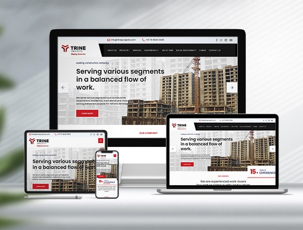
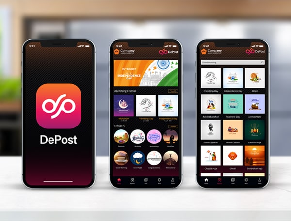
It’s great that your website is live — but if it was built years ago on older, fixed-width foundations, it likely isn’t doing your business any favours on a phone screen. People today reach for their mobile devices to search for a nearby place, complete a purchase, get directions, or order food, among dozens of other everyday tasks. Mobile has already overtaken desktop as the primary way people browse the internet, so a large share of your visitors are arriving from a smartphone right now. That shift creates a wide opportunity to capture business leads through a mobile-friendly website. Here are the reasons why responsive website design is no longer optional.
Why Responsive Design Is No Longer Optional
Increasing Number of Smartphone Users: Smartphones now account for the large majority of internet users, and well over a billion people access the web through their phones daily. With so much traffic coming from mobile, a smartphone-optimised website is essential for staying visible to your audience.
Same URL as the Desktop Site: A properly built responsive website design uses the same URL and underlying code as your desktop site. That makes it cost-effective to maintain and lets it automatically adapt as new devices and screen resolutions appear. A well-executed responsive layout also adapts navigation and images attractively to mobile, and it’s far easier for Google’s search spiders to crawl and index a single version of your content.
SEO Strategy Becomes Easier: There’s no need to build a separate mobile website when your main site is already responsive. Keeping a single site makes your search engine optimization strategy simpler to plan and track, since every ranking signal points to one URL.
How Mobile Users Behave Differently
People behave differently when browsing on a phone. With limited screen space, content has to work harder and communicate faster. Short videos and images tend to get consumed more on mobile than desktop, so capturing that attention means designing with mobile-first techniques — compact social share buttons, WhatsApp share options, and layouts optimised for a range of screen sizes.

Responsive Website Design and Development
People Also Switch Between Devices: Most of us move between a laptop, a tablet, and a phone throughout the day, often while researching the same purchase. Almost every visitor will land on your site from a handheld device at some point, and a poorly optimised mobile page can quietly derail a purchase decision that was otherwise going well.
Google, SEO, and Mobile-First Indexing
Google’s Priority on Mobile Websites: Google may choose not to feature a website in search results at all if it isn’t mobile-friendly. Mobile usability is one of the most important ranking factors Google looks at, and it crawls the mobile version of a site ahead of the desktop version through what it calls mobile-first indexing. In Google’s view, a website that doesn’t work for mobile users has limited value in search results, no matter how good the desktop experience is.
Mobile Is Essential for Social Media Marketing: Social platforms are used far more on mobile than on desktop, so a mobile-friendly website is essential if you want your social media marketing campaigns to actually convert. Since most traffic from a social post or ad click lands on a phone screen, a slow mobile site can undo the work of an otherwise strong campaign.
The Numbers Behind the Mobile Shift
The statistics make the case on their own:
• 50% of users agreed that even though they trust a particular business, they would use it less often if its website weren’t mobile friendly.
• 60% of users said they would switch to a competitor’s website if they couldn’t find the information they needed on your mobile site quickly.
• 80% of users said they would stop engaging with content that doesn’t display well on their device.
• 88% of consumers who search for a business on a mobile device tend to call or visit that business within 24 hours.
• 73% of consumers access websites on their mobile devices, yet only 20% of companies have a mobile-optimised site.
That last gap is the opportunity. If your competitors haven’t invested in mobile UI/UX design yet, a well-built responsive website can be a genuine point of difference for your business.
Responsive website design isn’t a trend to watch from the sidelines — it’s already the baseline that mobile-first users, and Google itself, expect. If your website was designed years ago and hasn’t been rebuilt around today’s mobile-first reality, now is the time to fix that. At Kumbh Design Inc, we build responsive, SEO-friendly websites for businesses across Ahmedabad and beyond.
Responsive website design means your website automatically adjusts its layout, images, and navigation to fit any screen size, from a small smartphone to a large desktop monitor, using one URL and one codebase. It removes the need to build and maintain separate mobile and desktop versions of the same site.
Google uses mobile-first indexing, which means it primarily evaluates the mobile version of your site to decide how it ranks in search results. A site that isn't mobile-friendly can lose visibility in search and frustrate visitors, both of which hurt your search engine optimization efforts over time.
If your website was built more than a few years ago, loads slowly on a phone, or requires visitors to pinch and zoom to read content, that's a strong sign you need a responsive redesign. Kumbh Design Inc can review your existing site and recommend the right approach for your business.