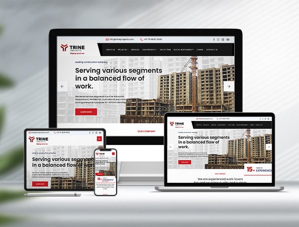
It’s time to switch to a mobile friendly website design. In 2026, mobile devices account for well over 60% of all global web traffic, and more than 5.8 billion people around the world now use a smartphone. Your website should be mobile friendly, because that is the single biggest opportunity to make sure your business is visible to mobile users, and increasingly, it’s also how most of them will decide whether to trust you.
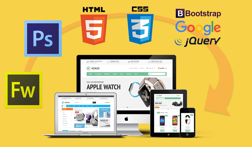
If you already have a mobile friendly website design layout ready, you’ll need to convert it into Bootstrap, HTML5 and CSS to make it truly responsive. You can look for a good HTML developer to handle this for you, or we can help you with this mobile friendly responsive website design project ourselves, from the very first PSD file through to a live, working page.
XHTML and HTML5 are what browsers use to display your website content. HTML5 builds on earlier HTML and XHTML markup with useful new features, including native support for audio and video streaming and playback, geolocation, and richer drawing capability through the canvas element. Together with Bootstrap, it gives us a solid, well-supported foundation to build a website that looks and behaves consistently across browsers and devices.
We help you build your site into a clean, table-less layout using solid CSS techniques and W3C standards, so cross browser compatibility is never a worry, and every line of code is hand-coded front-end development rather than templated. To get started, we just need your PSD website design file, and we convert it into a completely optimized web page with hand-coded XHTML, HTML5 and CSS structure.
Key Features of PSD to XHTML and HTML5 Conversion
Every project we take on for PSD to HTML5 conversion is built around a few core principles:
- Hand-coded XHTML Strict markup, so the code stays clean and predictable rather than relying on auto-generated bloat
- Semantic markup used for SEO, so search engines can understand the structure and content of your page correctly
- Light-weight, table-less CSS layout that loads quickly, even on a slower mobile connection
- Clean, W3C-valid XHTML and CSS, so your website renders the same way across browsers and devices
These fundamentals haven’t changed much over the years, because they’re still what makes a website fast, accessible and easy for search engines to read.
How We Do SEO-Friendly Conversion
With every sector facing huge competition, it’s extremely important that a company’s website does a good job of grabbing customer attention, while also helping the business benefit from search engines and online marketing. With this in mind, we make sure your PSD design is converted into XHTML or HTML5 in a way that is well optimized for leading search engines and genuinely helps your business grow, rather than just looking good.
The best option for turning a website design into a working web page today is a combination of Bootstrap and clean, modern design principles, similar to those in Google’s Material Design guidelines. Bootstrap’s grid system and pre-built components also make it easier for us to keep your layout consistent across desktop, tablet and mobile, without reinventing the wheel on every page. Feel free to contact us to know more about our skill set in this area.
Why a Mobile-First Approach Matters Today
Google now uses mobile-first indexing, which means it looks at the mobile version of your website first when deciding how to rank you in search results. A slow-loading or hard-to-navigate mobile site can cost you visitors and search rankings, no matter how good your desktop layout looks. That’s why we don’t just convert a static design into code, we also pay close attention to mobile UI and UX design, making sure buttons, menus and forms actually work well on a small screen and a touch interface, not just on a mouse and a monitor. A design that looks perfect on your laptop but is frustrating to use on a phone will quietly cost you customers.
Whether you already have a Photoshop design ready or you’re starting from scratch, our team can hand-code it into a fast, W3C-valid, SEO-friendly website design that works beautifully across desktop, tablet and mobile. Get in touch to discuss your PSD to HTML5 conversion project, and we’ll be happy to talk through the best approach for your website.
A mobile friendly website simply works reasonably well on a small screen, but a truly responsive website design reflows its layout, images and navigation to fit any screen size using CSS media queries and a framework like Bootstrap. At Kumbh Design Inc. we build fully responsive, mobile-first websites, not just mobile-friendly ones.
es. Share your PSD (or Figma/Sketch) design file with us and our team hand-codes it into a clean, table-less, W3C-valid HTML5 and CSS structure using Bootstrap, so the same design works smoothly across desktop, tablet and mobile devices.
es. We use semantic HTML5 markup, light-weight table-less CSS and clean, valid code, all of which make it easier for search engines to read and rank your site. Since Google uses mobile-first indexing, a well-coded, mobile friendly website design also has a direct impact on your search visibility.