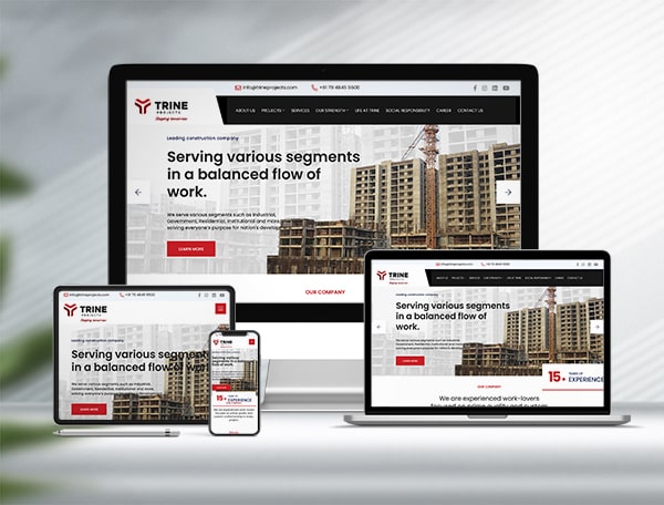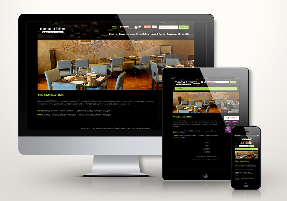
Responsive website design is one of the modern and preferred ways to build a web presence, backed by the latest technology support of HTML5 and CSS3. This type of website not only delivers a broader view but also adjusts to any device, whether a mobile phone, tablet or desktop, giving visitors the ultimate way to access your website from any location on their own device. So it is a plus point to build your website with responsive web technology and stay upgraded with the new generation of web and mobile technology.
In fact, responsive web design is an approach to laying out and coding a website so that it provides the best possible viewing experience, easy reading and navigation, with a minimum of resizing, panning and scrolling across a wide variety of devices, from desktop monitors to mobile phones.
What Responsive Website Design Really Means
A designer who creates a responsive design is supposed to make sure that the website’s navigation elements, screen layouts, text, images, audio/video players and other UI elements re-adjust themselves on a range of devices. Thus, a business does not need to spend additional time and money creating and maintaining one “mobile-site version” and another “desktop-site version” of its website.
Technically, this is achieved with fluid grids, flexible images and CSS3 media queries. Instead of fixed pixel widths, the layout is built in proportions, so columns stack, menus collapse into a mobile-friendly toggle and images scale to fit the screen. One codebase, one URL and one set of content serve every visitor — simpler to manage and easier for search engines to crawl.
Why HTML5 and CSS3 Are the Foundation
In the modern day, technology plays an important role in building user-friendly web applications. Since new technology arrives at regular intervals, building web applications on the newest technology helps users and clients manage their everyday functions. Today, HTML5 is the number one choice for developing web-based applications and websites, as HTML5 offers a long list of benefits.
That is why it is recommended to build a responsive website design with HTML5 and CSS3. One of the most excellent benefits of HTML5 is that it combines the best features of XHTML and HTML. Key features provided by HTML5 include native video, audio and other media support through predefined syntax, without depending on third-party plug-ins. Semantic elements such as header, nav, article and footer also give the page a clearer structure for browsers, screen readers and search engines.
CSS3 completes the picture. Media queries, Flexbox and CSS Grid let a layout rearrange itself cleanly for each screen size, while transitions and web fonts add polish without heavy images or scripts. Today, HTML5 and CSS3 truly are the rich prospect of the web world.
Benefits of a Mobile Friendly Website for Your Business
Day by day, the number of devices, platforms and browsers that need to work with your site keeps growing. Responsive WordPress web design represents a primary shift in how we build websites for the decade to come. One of the best advantages of responsive web design is that it works on both platforms, desktop computers and mobile devices, automatically adjusting the layout to the screen, while a normal fixed-width website works well only on a desktop computer. Thus, ultimately, responsive website design is a cost-effective solution in the longer term.
There is an SEO reason too. Google now uses mobile-first indexing, which means it primarily looks at the mobile version of your pages when deciding how to rank them. A mobile friendly website with fast-loading, readable pages gives both visitors and search engines what they expect, and it helps keep potential customers from leaving before they contact you.
Responsive Website Design with HTML5 and CSS3 at Kumbh Design Inc.
Here are some of the best things to know about building a responsive website design with HTML5 and CSS3 with us:
- We create responsive designs in Bootstrap as well as with Material Design principles.
- We assign a brilliant, dedicated web development team on your behalf, so you are free from recruitment work.
- We provide a well-rounded team of highly talented designers and developers to carry out your work as per the project requirements.
- You work with experienced, skilled experts with strong technical proficiency.
For more details on responsive, mobile friendly web design and responsive website development with CSS3 and HTML5, contact Kumbh Design Inc. or share your project details at online(at)kumbhdesign.com.
Responsive website design is an approach where one website automatically adjusts its layout, images and navigation to fit any screen, from a desktop monitor to a mobile phone. Your business needs it because customers browse on many devices, and Google uses mobile-first indexing, so a mobile friendly website supports both user experience and search visibility.
HTML5 provides semantic structure and native support for video, audio and other media without third-party plug-ins. CSS3 adds media queries, Flexbox and CSS Grid, which let the layout rearrange itself for each screen size. Together they form the foundation of modern responsive web development.
Yes. Kumbh Design Inc. can redesign or rebuild an existing website with HTML5, CSS3, Bootstrap or a responsive WordPress theme so it works smoothly on every device. Share your current site and requirements at online(at)kumbhdesign.com and our team will suggest the right approach.